Six things I always Google when using ggplot2

visualize
My frequently-used reference for styling {ggplot2} charts.
Published

January 27, 2020

Colorful dots making up a painting of a garden with two women

Henri Edmond Cross, Two Women by the Shore, Mediterranean (1896)

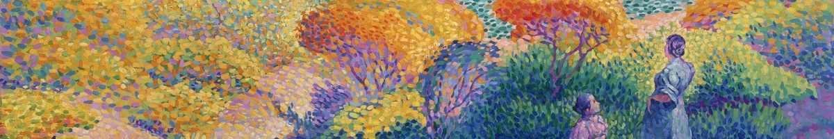
I often use {ggplot2} to create graphs but there are certain things I always have to Google. I figured I’d create a post for quick reference for myself but I’d love to hear what you always have to look up!

To showcase what’s happening, I am going to use a TidyTuesday dataset: Spotify songs! Let’s start by creating a simple graph.

library(tidyverse)

# Load Data
spotify_songs <- 
  readr::read_csv('https://raw.githubusercontent.com/rfordatascience/tidytuesday/master/data/2020/2020-01-21/spotify_songs.csv')

spotify_songs %>% 
  ggplot(aes(x = playlist_genre)) +
  geom_histogram(stat = "count")

Remove the legend

theme(legend.position = "none")

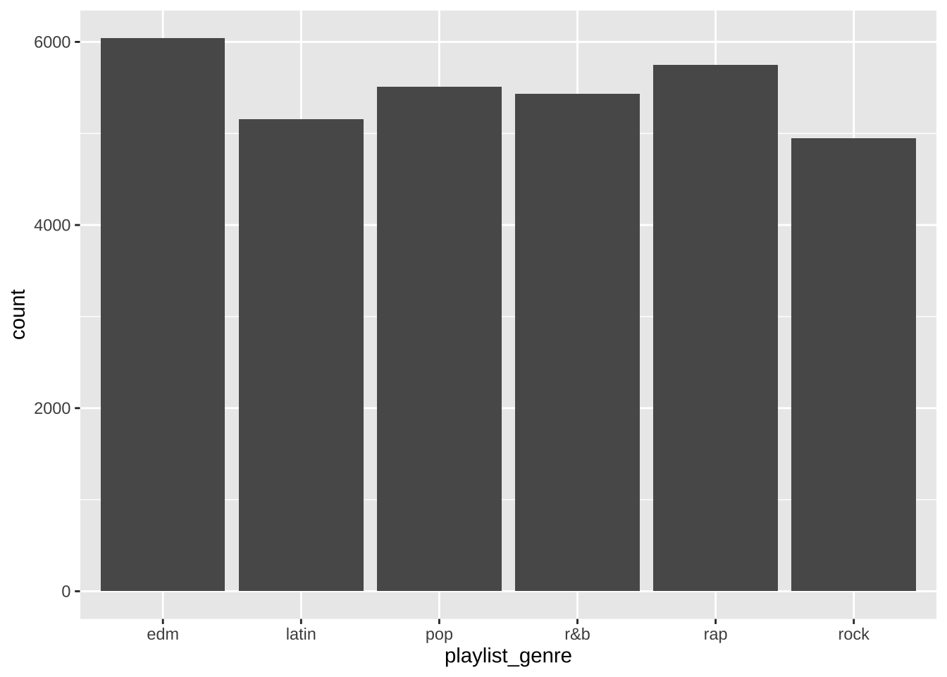
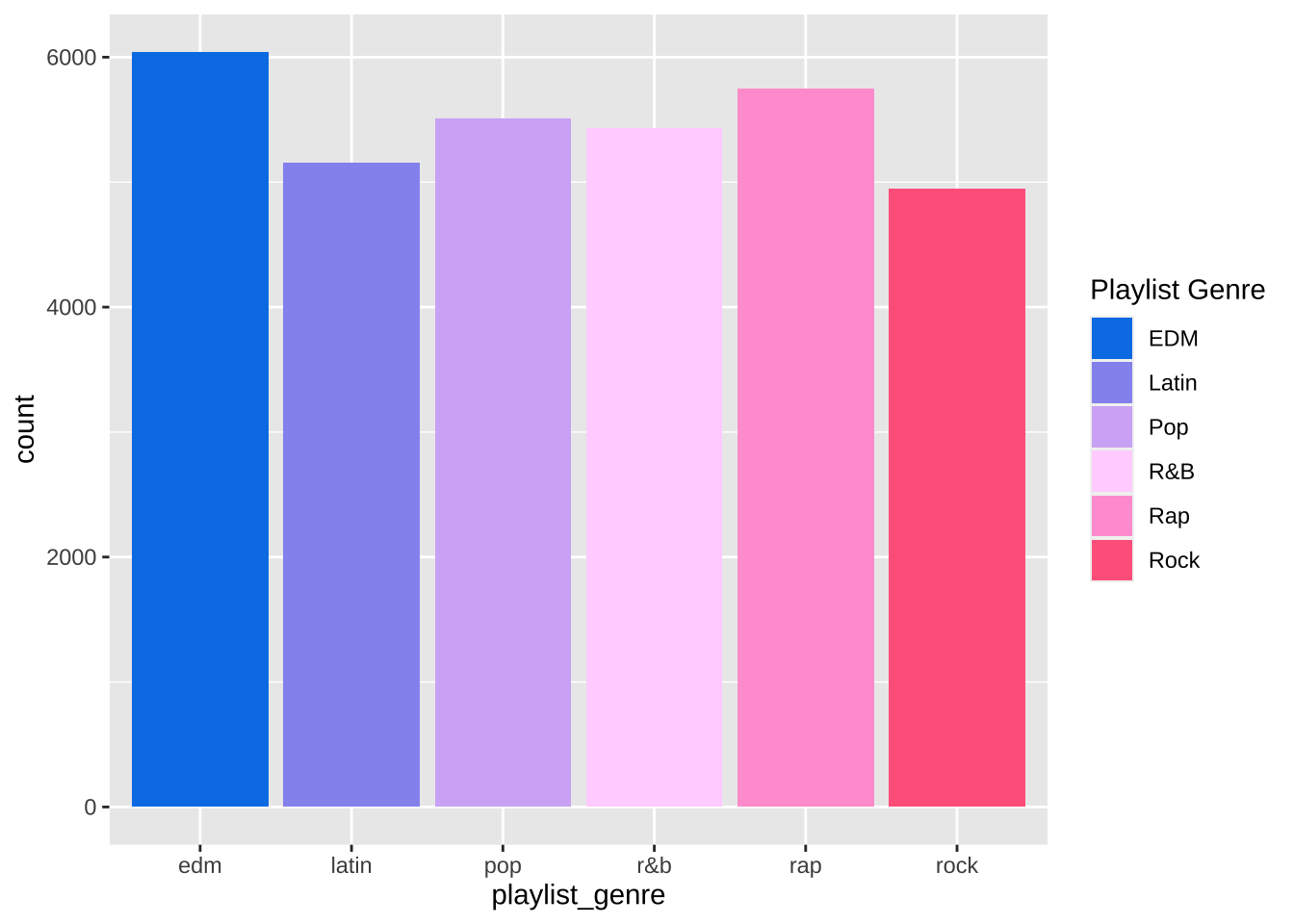
Ahh… this one always gets me. Sometimes when your color is mostly just for aesthetics, it doesn’t make sense to also have a color legend. This removes the legend and makes the graph look cleaner.

spotify_songs %>% 
  ggplot(aes(x = playlist_genre, fill = playlist_genre)) +
  geom_histogram(stat = "count") +
  theme(legend.position = "none")

Change legend title and labels

scale_fill_discrete(name = "New Legend Title", labels = c("lab1" = "Label 1", "lab2" = "Label 2"))

Alright, say I do want the legend. How do I make it something readable?

spotify_songs %>% 
  ggplot(aes(x = playlist_genre, fill = playlist_genre)) +
  geom_histogram(stat = "count") +
  scale_fill_discrete(name = "Playlist Genre", 
                      labels = c("edm" = "EDM", 
                                 "latin" = "Latin", 
                                 "pop" = "Pop", 
                                 "r&b" = "R&B", 
                                 "rap" = "Rap", 
                                 "rock" = "Rock"))

Manually change colors

scale_fill_manual("New Legend Title", values = c("lab1" = "#000000", "lab2" = "#FFFFFF"))

This is a bit trickier, in that you cannot use scale_fill_manual and scale_fill_discrete separately on the same plot as they override each other. However, if you want to change the labels and the colors together, you can use scale_fill_manual like below.

spotify_songs %>% 
  ggplot(aes(x = playlist_genre, fill = playlist_genre)) +
  geom_histogram(stat = "count") +
  scale_fill_manual(name = "Playlist Genre", 
                    labels = c("edm" = "EDM", 
                               "latin" = "Latin", 
                               "pop" = "Pop", 
                               "r&b" = "R&B", 
                               "rap" = "Rap", 
                               "rock" = "Rock"),
                    values = c("edm" = "#0081e8", 
                               "latin" = "#9597f0", 
                               "pop" = "#d4b4f6", 
                               "r&b" = "#ffd6ff", 
                               "rap" = "#ffa1d4", 
                               "rock" = "#ff688c"))

Remove x-axis labels

theme(axis.title.x = element_blank(), axis.text.x = element_blank(), axis.ticks.x = element_blank())

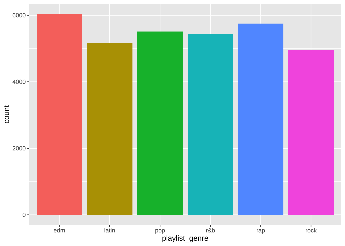
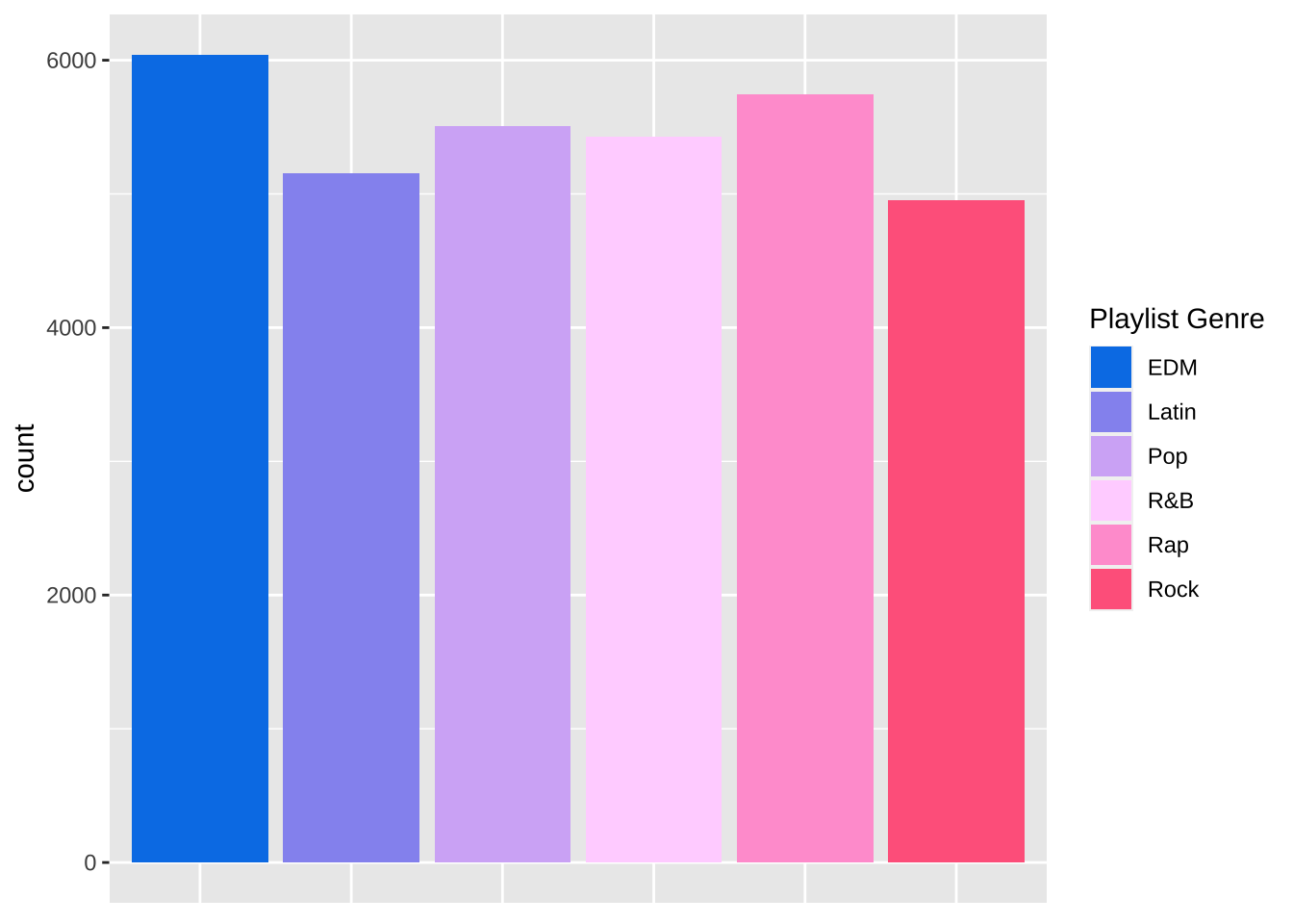
In this case, since we have a legend, we don’t need any x axis labels. Sometimes I use this if there’s redundant information or if it otherwise makes the graph look cleaner.

spotify_songs %>% 
  ggplot(aes(x = playlist_genre, fill = playlist_genre)) +
  geom_histogram(stat = "count") +
  scale_fill_manual(name = "Playlist Genre", 
                    labels = c("edm" = "EDM", 
                               "latin" = "Latin", 
                               "pop" = "Pop", 
                               "r&b" = "R&B", 
                               "rap" = "Rap", 
                               "rock" = "Rock"),
                    values = c("edm" = "#0081e8", 
                               "latin" = "#9597f0", 
                               "pop" = "#d4b4f6", 
                               "r&b" = "#ffd6ff", 
                               "rap" = "#ffa1d4", 
                               "rock" = "#ff688c")) +
  theme(axis.title.x = element_blank(),
         axis.text.x = element_blank(),
         axis.ticks.x = element_blank())

Start the y-axis at a specific number

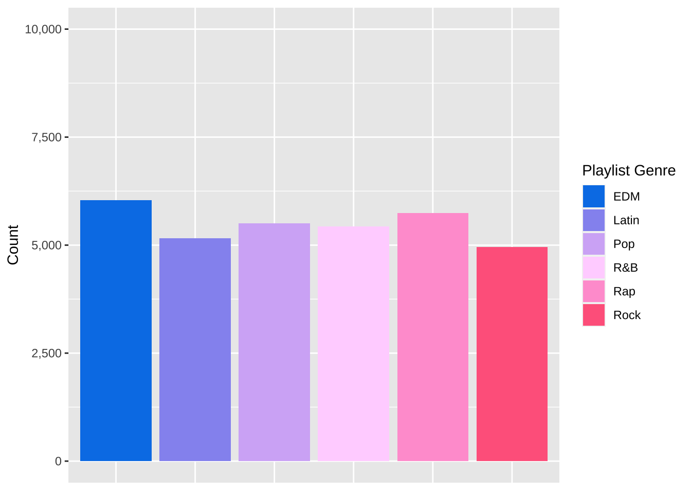
scale_y_continuous(name = "New Y Axis Title", limits = c(0, 1000000))

Often times, we want our graph’s y axis to start at 0. In this example it already does, but this handy parameter allows us to set exactly what we want our y axis to be.

spotify_songs %>% 
  ggplot(aes(x = playlist_genre, fill = playlist_genre)) +
  geom_histogram(stat = "count") +
  scale_fill_manual(name = "Playlist Genre", 
                    labels = c("edm" = "EDM", 
                               "latin" = "Latin", 
                               "pop" = "Pop", 
                               "r&b" = "R&B", 
                               "rap" = "Rap", 
                               "rock" = "Rock"),
                    values = c("edm" = "#0081e8", 
                               "latin" = "#9597f0", 
                               "pop" = "#d4b4f6", 
                               "r&b" = "#ffd6ff", 
                               "rap" = "#ffa1d4", 
                               "rock" = "#ff688c")) +
  theme(axis.title.x = element_blank(),
         axis.text.x = element_blank(),
         axis.ticks.x = element_blank()) +
  scale_y_continuous(name = "Count", limits = c(0, 10000))

Use scales on the y-axis

scale_y_continuous(label = scales::format)

Depending on our data, we may want the y axis to be formatted a certain way (using dollar signs, commas, percentage signs, etc.). The handy {scales} package allows us to do that easily.

spotify_songs %>% 
  ggplot(aes(x = playlist_genre, fill = playlist_genre)) +
  geom_histogram(stat = "count") +
  scale_fill_manual(name = "Playlist Genre", 
                    labels = c("edm" = "EDM", 
                               "latin" = "Latin", 
                               "pop" = "Pop", 
                               "r&b" = "R&B", 
                               "rap" = "Rap", 
                               "rock" = "Rock"),
                    values = c("edm" = "#0081e8", 
                               "latin" = "#9597f0", 
                               "pop" = "#d4b4f6", 
                               "r&b" = "#ffd6ff", 
                               "rap" = "#ffa1d4", 
                               "rock" = "#ff688c")) +
  theme(axis.title.x = element_blank(),
         axis.text.x = element_blank(),
         axis.ticks.x = element_blank()) +
  scale_y_continuous(name = "Count", limits = c(0, 10000),
                     labels = scales::comma)

There we have it! Six things I always eventually end up Googling when I am making plots using {ggplot2}. Hopefully now I can just look at this page instead of searching each and every time!

Liked this post? I’d love for you to retweet!